Great work mastering the basics of; creating PS documents, adding images, cutting out shapes, adding text and adding basic effects. Target: experiment with more advance text effects.
NEXT TASK: - Create a new blog post (title: Analysing Horror Posters) - Choose a horror poster and put the image of it on your post. - Write three paragraphs about how the poster follows horror conventions and attracts an audience through the following; colour pallet choices e.g. what colours are used? What do they connote (make you think of)? Why do they attract the target audience?, Imagery e.g. what is the main image? What does it connote about the film genre/narrative? Why will the image attract the target audience?, Title/text e.g. what is the film called? Why does the title show the genre? Why will the title make the audience interested in the film?
For the first time in history, news was broadcast in England last night by the British Broadcasting Company". So said the Daily News after the first two bulletins had gone out, the previous evening, from Marconi House, in the Strand.
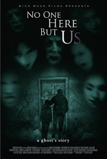
The colours represent a type of mood.The colours in this photo shows how it's dull and torn down. Another way they show 'fear' is how faces inclose they man and the little boy.The colour they used for the writing makes a effect on this image because, the main image is very dull and boring so that makes it stand out and also makes it clear to the reader that the title connects to the image . The film looks terrifying because the colours make it so gloomy and just gives you that sign of 'hmmm' and questions your self and wants then you to read the book. Also the title is at the top in capitals and in little font at the bottom is 'A ghost story' which makes you question again why have they done that . The dull colour 'black' represents a deathly feel to it and creates negative vibe.


Great work mastering the basics of; creating PS documents, adding images, cutting out shapes, adding text and adding basic effects. Target: experiment with more advance text effects.
ReplyDeleteNEXT TASK:
ReplyDelete- Create a new blog post (title: Analysing Horror Posters)
- Choose a horror poster and put the image of it on your post.
- Write three paragraphs about how the poster follows horror conventions and attracts an audience through the following; colour pallet choices e.g. what colours are used? What do they connote (make you think of)? Why do they attract the target audience?, Imagery e.g. what is the main image? What does it connote about the film genre/narrative? Why will the image attract the target audience?, Title/text e.g. what is the film called? Why does the title show the genre? Why will the title make the audience interested in the film?