detail horror poster analysis
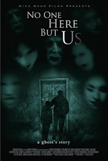
The colours represent a type of mood.The colours in this photo shows how it's dull and torn down.
Another way they show 'fear' is how faces inclose they man and the little boy.The colour they used for the writing makes a effect on this image because, the main image is very dull and boring so that makes it stand out and also makes it clear to the reader that the title connects to the image .
The film looks terrifying because the colours make it so gloomy and just gives you that sign of 'hmmm' and questions your self and wants then you to read the book. Also the title is at the top in capitals and in little font at the bottom is 'A ghost story' which makes you question again why have they done that .
The dull colour 'black' represents a deathly feel to it and creates negative vibe.


A good first attempt at analysis, I particularly like your colour discussions/ideas. Targets:
ReplyDelete1) Cover alla read of media language (imagery/text/layout).
2)Use more complex media language.